BBC
Based: London, Salford Staff: 110 Clients: bbc.com, BBC iPlayer Website: bbc.co.uk
Huge institutions like the BBC may seem to be unfathomable beasts but in many ways it seems the inner workings of the broadcasting behemoth’s digital offer aren’t all that different to those of any other platform. Having spoken to Steve Gibbons, head of user experience and design across the rather broad banners of “BBC iPlayer, A/V Experience, Television Platforms, Weather & Travel, there’s a sense that whether designing for an app start-up or an on-demand service viewed by more than three billion people a year, the priorities as far as digital design goes aren’t all that different.
While on the surface it may seem the BBC’s digital design team is far removed from the concerns of a traditional agency, working instead on a more linear stream of projects, the sheer breadth of the BBC’s offer means that Steve’s team works across numerous (and very different) platforms and products. So while all projects are essentially for one umbrella client, the juggling of priorities and the challenges of working across areas with wildly different concerns are the same.

“In some ways UX and design is seen as almost a horizontal discipline at the BBC,” says Steve. “There are so many products and services – news, children, iPlayer, learning…and this discipline cuts through it all, working to develop those services, or one element of them.”
So how would he describe the overall approach to digital design at the BBC? “We strive for coherence and consistency,” he says. “If people come to the news or to the iPlayer, we want them to have a very similar experience in terms of touchpoints like the global experience language, the audio visual language and the reading experience. We want to look at those core aspects of the BBC more coherently.
“We need to have designers working next to developers, always with a view that all disciplines are represented,” he adds. “That’s where great innovation comes from – collaboration. At the BBC we strive to be world class in audio and visual experience– and if anyone is, it should be us.”
Through uniting the BBC’s multifarious products and services through a streamlined and recognisable design template, the idea is that “once the users learn it once, they can use it anywhere.”

Steve says: “Different products have different needs, and different users have different needs – for instance watching or reading the news is often short form, but watching something on iPlayer is more a long form, lean back experience. So we’re trying to take in all those needs and create a pattern of interaction.”
Since iPlayer began in late 2007, it’s safe to say the internet has become a very different place. Similarly, the way we as viewers watch things has vastly changed too – for the most part, the days when everyone would watch the same things at the same time and chat about them the next day are over.
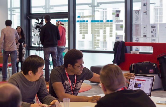
“The products reflect the nature of the audience, so we constantly have to evolve and iterate to meet audience demands. We’re continually working on things rather than being given a big brief, and once we’ve pinpointed what we can to look at it’s about all our disciplines getting into a room and brainstorming,” Steve explains.
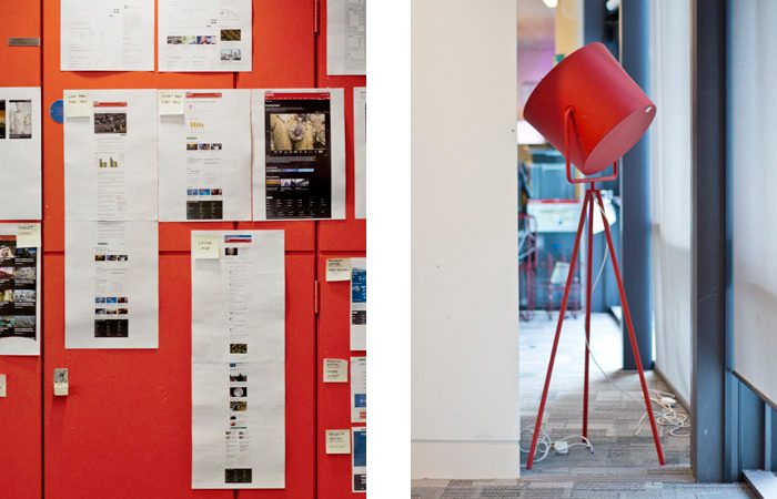
There’s a wonderfully lo-fi approach to the BBC’s process of developing and testing ideas. “We work in five day sprints by first diverging, getting ideas out, and then converging back into circles of movement and developing ideas quickly. We try to work very quickly, going from idea generation to honing it into a prototype and testing, and then moving on. It’s a great way to keep it moving or kill an idea quickly. You get a sense of what could have a life, and you don’t end up putting a lot of time and effort into something that might not be right.”
There’s “no fixed process” to testing new ideas. In the early stages the team often ends up carrying out what he calls “guerrilla testing,” sometimes asking willing participants on the street what they think of a certain idea or innovation. Ideas are mocked up on paper as much as in code, and it’s only in later stages that serious “lab-based testing” with carefully selected market research groups get involved.
The end goal is always the same though, to create digital services and products that have content at their core, look good and function seamlessly. “Aesthetics, content and function go hand in hand - it’s dangerous to separate them,” says Steve. “If one of those things is lacking it’ll never create that loyalty or love people have. If you create something truly great and memorable it’ll be a delight to use.”